
 Illustration by Donna Pidlubny
 This article was originally posted in April of 2012. I am posting it again here, because I feel the information could be helpful to artists, illustrators and buyers alike.
How It Works
I can’t count the number of times I get asked about my work, my process and my marketing. I’m hoping this post will answer a lot of your questions, or at least give you a little insight into the world of an artist, and how the image is conceptualized, developed and the evolution it goes through.
This is about one such illustration, from start to finish, and the steps I went through from concept development through to approval and publication.
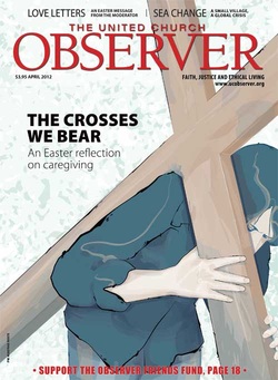
Client: United Church Observer Magazine, Easter Edition, April 2012
Usage: Cover, interior full page, Web, and web archive
Chelsea Jones of the United Church Observer Magazine sent me an email, asking if I would be interested in creating a cover illustration which would also be published in the interior, with the feature article, on their web site, and in the web archive. I consulted the most current copy of the Graphic Artist Guild Handbook for pricing and ethical guideline, and we settled on a price. The contract was prepared with information from the GAG Handbook and once signed I started to work on the ideas. This process is done with thumbnail drawings. Small simple sketches that help me work out the ideas and bring them into visual form.
I Ask Questions Too
One question I always ask new clients is how they found me. Was it from a recent promotion, referral, or one of my portfolio sites or . . ? This question is important because it will help track the marketing I’m doing, and determines if my limited funds are spent wisely. Her answer surprised me. “I just found you on-line and liked your work” For those who don’t know, that is so rare that it almost never happens. I imagine it was the meta tags that brought her to me. I guess it was worth the time it took to write a little something about each painting on my site.
Directions
Author Trisha Elliot, wrote an excellent article which talked about the cross caregivers bear for others. Chelsea and I discussed the story and there were a few points she wanted to make sure I took into consideration before starting.
1. The illustration should not be ‘literal’ but instead be conceptual.
2. The crosses should not be dominate, but a subtle reference.
3. It should not in any way relate to dementia since this is the focus of the March issue. That was pretty much it, the rest was up to me.
Down To Work
When I read the draft, two things stood out. First; that the majority of the caregivers are women. Second; they are usually middle aged or a little older, those who have already spent a good deal of their life giving care to their families.
I started thinking about other kinds of care that sometimes leads to a lifetime commitment on the part of the care giver. This lead me to the idea that the person who is dependent on care is often “the elephant in the room” so to speak. A very awkward concept to develop. I looked at child care, autism and the juggling act that care givers often perform. All of these were good ideas, but really wasn’t sure if I was going down the right road. The ‘not being literal’ thing was really taking me down a bumpy road, and it was the weekend, so I couldn’t call for any input. I decided to make thumbnails of these ideas and see if I could get a read on what the editorial team had in mind.
Back To The Drawing Board
I set to work with my sketch book and developed 4 sketches. They were all rejected, “It’s not what we are looking for”. Hmm, . . . now what? Back to the drawing board. It took me a little time to realize they actually did want something more literal, so I came up with a couple more sketches and sent them to Chelsea. The response was “this is exactly what we are looking for” and I was given the green light to go ahead, with notes from the designer/art director, Ross Woolford. He also sent the sketch placed in position with the Masthead of the magazine so I could see what he could see.
I finally hit the nail on the head with this drawing
Understanding The Client
Getting a read on a new client is often very difficult. I don’t have a religious background, so it took me a bit to understand when she said that she didn’t want it to be literal, what she really meant was, we don’t want a historical painting of Jesus with the cross. When I got that, I knew which direction I wanted to go.
Where Ideas Grow
Where did I get the idea? Once I realized that the initial request for conceptual wasn’t really what they wanted, I quickly developed this one. I sat down with my Mac Book Pro and started searching for articles and images on people who carry the cross. I was amazed at how many people do this around the world. I had no idea. From that, it developed into something I felt was a good direction, and one that they might want to take.
Some of the notes they sent me when they gave me the “go ahead” were a bit of a challenge, and I needed to take some license in order to make it work. I developed a drawing, also called a linear, which just means it has much more detail in comparison to the thumbnail. Because the directions I received were so tight, I really didn’t have much option on how to produce the piece. But instead of proceeding right into painting, I sent the linear for approval. They rejected it, and wanted to return to the original idea. They also removed one of the biggest restrictions they had placed on me and wanted to focus on the burden of the cross. The second and final linear was approved and now I could start the painting process.
Planting The Seed
The development part of the process is the most work. An illustrator has to be a mind reader of sorts, figuring out what they want, even though they really don’t know what they want. The artist must also be original, creative and be able to connect with the audience while staying true to style and brand. So you see, they didn’t call me up and say could you do a picture of a woman carrying a cross. You can see now, that’s not how illustration works. They give me a seed and I plant and water it.
Earlier in our discussions they had asked that I use a similar background to a previous painting I had done called Daydream. I agreed and created a background that mirrored the previous painting, even using an almost identical colour pallet. The strongest colour has a bit more of a greenish hue, and the light creamy colour is actually a percentage of the inverted colour tone of the blue.
Finishing Up
The final step was adding my black layer, which for the most part is done with a custom designed brush I made to simulate a technique I used when I created my illustrations in a traditional manner.
I really enjoyed working on this project. It was a challenge, but gave me an opportunity to explore and learn about something I may never have otherwise looked at, as well as an opportunity to give my small voice to those caregivers who selflessly carry-on each day.
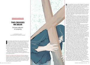 Interior Spread
 [Interior 2 page spread of Illustration with text of story]
The text on either side of the same image that appeared on the cover
You can purchase a print on canvas (minus the text) here exclusively on Fine Artists World Gallery
The text on either side of the same image that appeared on the cover
You can purchase a print on canvas (minus the text) here exclusively on Fine Artists World Gallery

 RSS Feed