Fine Artists WORLD GALLERY - Donna Pidlubny
  • HOME
  • Shop
  • Original Paintings
  • Prints
  • Reproduction Rights
  • Books
  • ART Talk-Gallery Blog
  • About
  • Contact

A few rules for handling oil paints

9/11/2013

 
First Published
Aug 7, 2013 9:09 AM

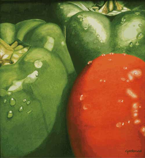
Whenever I get an opportunity to visit a used book store I always take it. I'm currently in Charlottetown, Prince Edward Island taking in the wonderful art galleries and crafts shops. The work here is exceptional and second to none. I highly recommend a visit to the island. While walking down Queen Street I found a wonderful used book store called The Book Emporium. My focus is on old out of print books, especially ones on techniques that offer lost insights. One such bit of information is as true today as it was when the old masters created their exceptional art. This method was taught to me while I was in art school and I felt it was worth repeating.  We often forget our earliest lessons.

1. Always use the simplest ingredients possible. Use the best quality and make sure the purity is beyond doubt.
2. Use as little dryer as possible.
3. Begin a picture 'lean' and finish 'fat'. Less oil in the first layer, the less danger of cracking.
4. Two thin coats are usually better than one thick.
5. Be sure your paint is completely dry before painting over it. The under coat will contract as the drying process occurs and crack the top coat.
6. If the paint does not take or stick well, rub the surface with a fine sandpaper or other substance to roughen it to create a tooth.
7. Never use more medium or liquid than is necessary. The colors will stay fresh and luminous when left alone. When fully dry, protect the colors with a quality varnish.

Dry Brush Painting

9/11/2013

 
First Published
May 22, 2013 4:58 PM

A technique artists use for creating a broken or mottled effect with water paint or ink, often revealing traces of the paper or underpainting. The technique is accomplished by holding the brush at such an angle that its side lies almost flat against the paper, or by drawing it rapidly across the surface, as one might a pen stroke. In oil painting, a similar broken effect is called a dragging stroke or scuffing.

"Is it Fine Art or Illustration?"

9/11/2013

 
First Published
Apr 26, 2013 12:19 PM

Over the decades working as a graphic designer, illustrator and a fine artist, I am often asked "What is the difference between illustration and fine art?"

First lets look at the dictionary tells us. 
Art is the expression or application of human creative skill and imagination, typically in a visual form such as painting or sculpture, producing works to be appreciated primarily for their beauty or emotional power.

Illustrate has it origin in the early 16th century and means to illuminate or shed light on. An illustration is used to explain or make something clear or to serve as an example.

All artists pursue their own conceptual goals through expressing their creative skills in their own artwork. An illustrator is usually under a commission to produce a creative piece of art, use their creative skills as requested by the client. Many see this as a hindrance to the artists creativity, but this is not always the case. The Artist is usually hired for their creativity not just in the execution of the art work but in the concept development, or the artists own take on the idea, as well as compositional skills to create the artwork.

Sometimes an illustrators creativity can be stifled by the client, by over directing the project, including conceptualization and composition, and not allowing the highly trained artist do what they were hired to do. This can hinder the artist as the client may not actually be able to communicate their ideas easily.

On some occasions, the client has done the research and has a correct feel for their audience. The conceptual ideas they offer to the artist to follow can work perfectly and gives the artist a firm foundation to apply their creative ability to the project and can produce a very successful piece of artwork.

The difference between Fine Art and Illustration is blurred, and it is only the intentions that seem to separate the two.

For example, Michelangelo was commissioned by the Roman Catholic Church, Pope Julius II to paint the ceiling of the Sistine Chapel. In essence, the client (the church), gave Michelangelo a brief, outlining the direction of the artwork and the subject matter, which was limited to the Old and New Testament. Michelangelo still had the creative freedom to conceptualize, interpret, and create using his own imagination and creative skills. Taking over four years to complete, this artwork was a commissioned job and therefore is actually Commercial Art or Illustration. But it is considered one of the artists finest pieces of artwork and one of the world’s greatest and most famous fine art achievements.

Whether we agree or disagree that the line between Illustration and Fine Art is very defined or not, we must agree any artwork produced has part of the artists emotions, creativity and feelings amongst the colours and visuals.

Ultimately the viewer, or the buyer of the art is the one who decides. Marcel Duchamp (1887–1968) considered one of the most important artists of the 20th century, believed that anything perceived as art, is art. It's how we perceive it, and have we "created a new thought for that object.”

“Art is not about itself but the attention we bring to it.” Marcel Duchamp

What is Green Earth Clay and What Is It Used For?

9/11/2013

 
First published
May 25, 2013 2:26 PM

A clay containing iron silicate; a permanent pigment occurring in a limited range of color medium-pale willow or celadon shades. Green earth comes from various parts of the world, the best commercial grades are found in small deposits in central Europe and Cyprus, called Tyrolean and Verona (bluish), Bohemian (clear middle-green), Cyprian (yellowish).

Green earth has been a favourite pigment for watercolor and other water based media since the time of Byzantine and early Italian tempera painting.

What are some art styles?

9/11/2013

 
Abstract
Abstraction indicates a departure from reality in the depiction. It can be a slight departure, partial or complete. Artwork which takes liberties with color or form can be considered partially abstract. Total abstraction bears no trace of any reference to anything recognizable.
Abstract Expressionism
Abstract Expressionism is commonly called Action Painting or Color Field Painting, and The New York School. It exploded onto the art scene after World War II with its characteristic messiness and extremely energetic applications of paint. To the contemporary audience, it hardly seemed worthy of the name "art", but that's what the critics said about Impressionism too.
Expressionist
The artist tries to express certain feelings about something. The artists that painted in this style were more concerned with having their paintings express a feeling than in making the painting look exactly like what they were painting. 
Impressionism
A group of independent artists in 1874, organized an exhibition in Paris that launched the movement called Impressionism. Despite their diverse approaches to painting, appeared to contemporaries as a group. Conservative critics wrote that their work was unfinished, and sketch like appearance. The work was thought to capture a moment, like one might see if only viewing something for a second or two.
Cubism
A modern art style made up mostly of paintings. The paintings are not supposed to look real. The artist uses geometric shapes to show what he is trying to paint. Early cubists used mainly grays, browns, greens, and yellows. After 1914, Cubists started to use brighter colors. Cubism was the beginning of the Abstract and Non-objective art styles.
Fauvism
Fauvism was an art style that lasted only four years, beginning in 1905. The word Fauvism is french for "wild beasts". It got this name because the paintings had bright and unusual colors. The subjects in the paintings were shown in a simple way, and the colors and patterns were bright and wild.
Pointillism
The artist uses small dots to make up the pictures. From far away, these dots blend together to form the picture and give the impression of different colors as they blend together.
Pop Art
Pop art can be any every day item that is drawn in a colorful way, taking every day subjects, making them the focus of an art work. It is inspired by comic strips, advertising, and popular entertainment.
Post Impressionism
Beginning in the 19th century, it was mainly still life and landscape paintings. The post impressionists liked to use lots of colors and shadows.
Primitive Art
Primitive Art looks like art that is done by a child. Usually the picture is painted very simply, and the subjects are "flat" or two-dimensional. This is a style and not a time period, like modern art.
Green Peppers and Tomato by Gordonna
A Realism and Still Life Painting by Gordonna
Title: Green Peppers and Tomato

Realism 
This style of art that shows things exactly as they appear in life. It began in the 18th century, but the greatest Realist era was in the mid-19th century. Most Realists were from France, but there were some famous American painters who were Realists also.


High Realism or Ultra Realism
This style of art shows things exactly as they appear in life, but also shows more than a viewer would normally see. Extremely detailed, and beyond realism. The movement started in the 1960's with the onset of photorealism, and has now evolved into Hyperrealism which began in the early 2000's.
Surrealist Art
In this style paintings were generally based on dreams. Their paintings were filled with familiar objects which were painted to look strange or mysterious. They hoped their odd paintings would make people look at things in a different way and change the way they felt about things. They thought that their paintings might stir up feelings in the back of peoples minds.

Trompe l'oeil
French for "deceive the eye" is an art technique involving realistic imagery in order to create the optical illusion that the depicted objects exist in three dimensions. Trompe l'oeil, is also used in contemporary interior design, where illusionary wall paintings experienced a Renaissance since around 1980.
Aboriginal Art
Is a term applied to North American Native Art and Indigenous Australian art and is art made by the Indigenous peoples of both countries. The styles in North America vary widely, depending on the origin or location. You will see terms like Haida art and Woodlands art. The traditional art is very stylized and graphical in nature.
Illustration
An illustration can be a drawing, painting, photograph, or other image that is created to help depict a story. A colorful visual aid in a sea of grey on the printed page, are made in a variety of ways, and styles, and can be seen in publishing, in advertising, and on the web.
Graphic Arts
Graphics are visual presentations on some surface, such as a wall, canvas, screen, paper, or stone to brand, inform, illustrate, or entertain. Graphics word is derived from the word graph. An image that is generated by a computer called graphics, is a pictorial representation and manipulation of data, as used in computer-aided design and manufacture, in typesetting and the graphic arts, and in educational and recreational programs.

Fairyland #2 by Dan Merritt
Decorative Art by Dan Merritt
Title: Fairyland #2
Decorative Art
The decorative arts is traditionally a term for the design and manufacture of functional objects. The decorative arts are often categorized in opposition to the "fine arts", namely, painting, drawing, photography, and large-scale sculpture, which generally have no function other than to be seen. In recent times it also refers to art that is a decorative element for interior design. Paintings are generally picked for colors and subject, but not the concept.


Still Life Painting
A still life is a work of art depicting mostly inanimate subject matter, which may be either natural such as food, flowers, plants, rocks, or shells or man-made drinking glasses, books, and vases. Still life paintings give the artist more leeway in the arrangement of design elements within a composition than do paintings of other 
types of subjects such as landscape or portraiture. Some modern still life breaks the two-dimensional barrier and employs three-dimensional mixed media, and uses found objects, photography, computer graphics, as well as video and sound.
Figure Painting
A figure painting is a work of fine art in any painting media with the primary subject being the human figure. The human figure has been one of the constant subjects of art since the first stone age cave paintings, and has been reinterpreted in various styles throughout history.

For more information.

Buying Art For My Condo

9/11/2013

 
First Published
Apr 24, 2013 11:20 AM

So you just purchased your first condo, a space that is just big enough to stay sane. Buying a piece of art for your condo can feel like a daunting task, and all of sudden you may become keenly aware of interior design, textiles, furniture and all the elements that enhance your living space. It can be an intimidating world. Here are some tips to help you navigate the art of buying art.

1) Pick art that you actually like!
 
Sounds simple, but it is very important. Don't worry about trends, or what's in fashion, they fade. Go your own way when it comes to your art purchases. You want something that speaks to you. After all, you are the one who has to live with it.


2) Grace & Style

Go with something that fits into your urban surrounding or theme of your decor and furniture. If your furniture says art deco, then you may want art deco paintings as well. But you can consider contrasts, such as traditional native or aboriginal art which is also highly designed and stylized.

3) Location, Location, Location

Each room will call for a different feel and different style of art. For your bedroom you would want to select art that is more calming or “seductive”. Your living or dinning area is a great place to get wild and explore with stronger colour’s and themes.

4) Pick Art That Suits The Room

Small spaces don't offer the same options as large spaces for moving furniture around to make the art work, so choosing can be a daunting task. You may want to consider several small works of art vs one large dominating piece. If you choose this route, try hanging the art in clusters, grouping the works of art and balancing them by the colors or weight. This can be as bold a statement as one large piece, and is more budget friendly, by adding art to your collection as you can afford it.


5) The Right Light

Take measures to protect your art from too much direct sunlight as almost all art will fade if placed in this type of environment. Acrylic and oils seems to have passed the test of time, but with all others caution should be applied.

6) Death by Hanging

There is nothing worse than a poorly hung piece of art. As simple as it may be there is a right way to hang art. The general rule of thumb is paintings should be hung so that the centre of the painting is at eye level. If two occupy the living space, one at 5' and one at 6'6" then try a compromise by meeting in the middle. 


7) The Right “Frame” of Mind

It isn’t essential to have a frame around your art. Giclee fine art prints on canvas finished with a simple black edge is all you need and will blend with most rooms. If you do select a frame, tie it in to the location where the artwork is to be hung, as well as in to the artwork itself. The frame should be a continuation of the picture rather than a contrast.

8) Colors

When selecting a painting to match color, select one or two of the boldest colors in your room and look for art that has those colors in it. You’re not looking for an exact match here. Picking up one or two of the same colors will send a message that the painting belongs in this environment. When purchasing online, view the art on a couple of different monitors before you decide. 

Interation of color demonstration
9) Show Off Your Art

When you walk into a gallery or museum, what do they all have in common? White walls and lots of light. If a wall is papered or painted in a bold color, it limits the choices for hanging art. Keeping your walls neutral allows you to explore color in your art. A bold wall color can also change how you see the art as shown by the swatches here. Believe it or not, the centre square is the same color. The true color can be viewed in the last swatch.

10) Cost

Beauty is in the eye of the beholder. If it fits, you like it, and it is appropriate then go for it. Giclee prints on canvas offer lots of affordable options for wall art, and it will look like you spent a fortune.

11) Break The Rules

Making art is about breaking rules, so why shouldn't buying art be as well? If you find an art work that you really want, but it doesn't fit into any of the mentioned rules, then buy it anyway. You will find a place for it. Consider buying the art first, then get furniture to match the art.

Fine Artists World Gallery offers affordable options for art buyers for small and large spaces. We want you to love art as much as we do, and we want you to love what you buy. So we are offering a 1 year return policy for all Fine Art Prints on Canvas. We call it our 365 Day Happiness Policy. No risks here. Buy art for your condo, and hang it up. If after one full year you still don't love it, then return it, no questions asked. We will find a good home for it. www.fineartistsworldgallery.com

Terms In Art

9/11/2013

 
First Published
Apr 23, 2013 1:00 PM

There are many styles in art, some of which became very popular while others faded into obscurity. In the 19th Century there were styles such as Art Nouveau, 1890-1910, Arts and Crafts Movement, founded in 1860 in addition to the ones already mentioned. In the 20th century we saw cubism, impressionism, art deco and pop art on the long list. In the 21st century we are seeing digital art, computer art, re-modernism, virtual art and graffiti art, which is also sometimes referred to as urban art. Artist still produce art in traditional ways and many work is similar to the styles in history. They might best be described by putting the word contemporary first when describing them: contemporary realism, contemporary abstract, and so on.

What is the difference between Modern & Contemporary Art?
People often get confused as we use the word modern to describe something which is new and exciting. In the art world "Modern" refers specifically to the time period, and "contemporary" is the correct term to use when describing new artworks.

Modern Art is a term used to define Modernism; which included movements such as: Impressionism, Post-Impressionism, Fauvism; Cubism; Expressionism; Dada, Surrealism, and Pop Art, spanning a time from about 1890 to 1960. These movements were all influenced by a variety of factors such as light, color, asian art, and african art. Artists such as Picasso, Munch, Matisse, Renoir, Mondrian, and Kandinsky would be therefore considered "Modernist Masters".

Contemporary Art is generally used to describe recently made artworks in particular, made in the last 10 to 20 years. If you are a contemporary artist, then you are an artist who is creating artworks now, but you may be heavily influenced by the past. Contemporary artworks use a variety of materials and techniques and often use new technologies such as computers.

Right to Privacy?

9/11/2013


First Published
Jun 4, 2013 10:42 AM

A recent article published by the Associated Press about New York City artist Arne Svenson talks about a controversy the exhibition has stirred with the occupants of the building across the street.

The photographic exhibition shows images taken from the artists second-floor apartment of some of the occupants. The residents of this glass-walled luxury building had no idea they were being photographed and they never consent to being the subjects for the works of art, feel a line has been crossed. The artist writes; "they are performing behind a transparent scrim on a stage of their own creation with the curtain raised high".

The artist did not show the faces, so the subjects could be anyone. In one photo, a woman is on all fours, presumably picking something up, her posterior pressed against a glass window. Another photo shows a couple in bathrobes, their feet touching beneath a table. And there is one of a man, in jeans and a T-shirt, lying on his side as he takes a nap.

When you move into an all glass building, and don't close the window coverings, or even have them, what right to privacy do you have? If you believe no one will look in, think again. You have extended an invitation.

We are now in a society of living in public, all your private thoughts and actions are out there for anyone to see, and engage with. There are cameras on every corner, in public and private buildings, subways and buses, and toll booths. Digital technology, social media, and world wide internet access controls our day to day activities. We are constantly being monitored, photographed and watched.

If you want and expect privacy then close your drapes, throw away your cell phone, dump the internet, and move to an isolated location in the woods by yourself, and then only the wild animals can watch you. And what are they saying? Perhaps, "Dinner at the waters edge."

Sharing food, culture and illustration

9/11/2013

 
First Published
Apr 30, 2013 12:28 PM

Arts collective Doodle Plate has set itself the admirable task of sharing experiences around food, stories and cultures. For its first project, it’s the food and culture of Mexico that’s under the microscope – through illustration exhibition Nixtamal.

For Nixtamal three illustrators – Adam Bletchly and Livi Gosling from the UK and Oliver Flores from Mexico – focused specifically on the process of making tortillas. 
Nixtamal is an Aztec word which describes corn that has undergone a lime-treating process, crucial in the making of tortillas.

All three illustrators were asked to develop creative responses to this process.Stephanie Odu, who curated the Nixtamal show, says, ‘Researching this process presented the opportunity for our illustrators to delve into another culture, or their own – with work produced by one Mexican illustrator and two British illustrators.

‘Their work, inspired by this process, provides an accessible learning process. And we aim to inform people’s experiences, and engage them with the traditions of other cultures.’

Nixtamal is at the Hundred Years Gallery, 13 Pearson Street, London E2, from 22-26 May.
Original article can be found at http://www.designweek.co.uk/

NSCAD University does it again

9/11/2013

 
Tapestry by Samantha MerrittTapestry by Samantha Merritt
First Published
May 21, 2013 5:08 PM

It was my sculpture professor who first told me about NASCAD while I was doing my undergraduate studies in a university in the United States. He asked why I didn't attend that school instead of the one I was at. I had to admit that I had never heard of it. He replied by telling me that this was the top art schools in North America, if not beyond. Over the years, I followed NSCAD University, and even visited on occasion, and it was not only keeping up its reputation, but expanding it. When it was my daughters turn to choose a school to study at I mentioned NASCAD and she too had never heard of it. I started to wonder if this was the best kept secret in the art world.

Once she saw the information, she was sold and off to study she went. Over the weekend she graduated, making the deans list with a BFA with a major in Textiles, and a BA in Art History. I had an opportunity to visit the graduation exhibition and was really impressed with the quality of the work on display. These are our future teachers, artists, and thinkers. We are in good hands as our society moves forward.

Over the past few months I've taken in several graduate shows from various schools, and until I visited the Sheridan College Illustration graduation exhibition and now the NASCAD University exhibition I was starting to wonder what the schools were up to. Cranking out graduates for the piece of paper, instead of the quality of work, the conceptual abilities, and critical thinking. Part of the function of universities is to teach students how to think, and how to expand on their thoughts, without which we would be doomed to a dreary existence that never evolves.

After visiting NASCAD and speaking with the students and instructors I have faith in the future, and the evolution that is inevitable. I was blown away at the quality of work on display, and the outstanding supportive environment that exists at NSCAD. Above Art piece by Samantha Merritt.

Art work by Audrey Turner
Artist: Audrey Turner

A big shout out for the exceptional work all around by the students and professors, and a thank you.

<<Previous
    The Great Hug Me Too by Donna Pidlubny

    Anna Lia & The Magical Christmas Gifts by Donna Pidlubny

    Categories

    All
    Commentary
    Developing Artists
    Finding Creativity
    Interesting
    Materials & Techniques
    News
    Reviews
    Terms In Art

    RSS Feed


    Archives

    August 2019
    March 2017
    November 2016
    May 2016
    January 2016
    October 2015
    June 2015
    May 2015
    March 2015
    February 2015
    January 2015
    December 2014
    November 2014
    October 2014
    September 2014
    August 2014
    July 2014
    June 2014
    May 2014
    April 2014
    March 2014
    February 2014
    January 2014
    December 2013
    November 2013
    October 2013
    September 2013


Copyright Notice: All artwork on this site is copyrighted and owned outright by the artist. If you wish to use any of the material you must provide payment for reproduction rights. Final usage rights not guaranteed. Contact Donna to see if the image is available for your project.