Fine Artists WORLD GALLERY - Donna Pidlubny
  • HOME
  • Shop
  • Original Paintings
  • Prints
  • Reproduction Rights
  • Books
  • ART Talk-Gallery Blog
  • About
  • Contact

Why Do Artists Choose What They Choose?

8/18/2019

0 Comments

 
As an artist, I look for unity in chaos. It may come as colour, form, light, or subject, and so much more. If I cannot find it, I can create it; purposely choosing something to make the art flow to match my vision. As artists, we learn this with formal art training or through the school of hard knocks. We build on these insights throughout our careers, finely tuning our voice over time. ​
I’ve often wondered why artists choose what they choose. Why does an artist decide to paint flowers, portraits or landscapes? What is it about that subject matter that attracts the artist? Is there something beyond form, colour, subject, and light? Is there an energy that vibrates, displaying a field of information that grabs the artists attention.

Early in my career, I wrestled with the question of what to paint. People would give me suggestions, but I found they rarely worked for me. Technically I could pull it off, but something was missing.

It wasn’t until I learned to quiet my mind and just sit with the energy around me, that the answer started to reveal itself to me visually and emotionally. I started to realize that all matter vibrates at a different frequency. If it didn’t, everything would look the same. I believe that when one vibration matches another, an attraction is formed. When I sit quietly, and the energy matches mine, it will reveal itself to me. Then I can capture it, and put it on canvas or paper.
Green by Donna Pidlubny
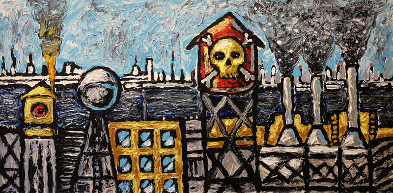
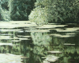
"Green" - 16"x20" - 40.64x50.8 cm - Acrylic on Canvas ​
According to the laws of physics, energy never goes away, but changes form.
Quantum physics teaches us that thoughts are energy. 
Vibratory waves emitted by thoughts affect the Quantum world.
The act of observation changes what is being observed, and how it reveals itself.

An atom is a field of energy pulsating outward. We know that everything is energy and, it’s all connected. The Chandra telescope sees the energy of the stars connected as a mesh of pulsating energy. Yet the Hubble telescope sees these same stars as individual bodies. So which is correct? The answer is both. It’s all in the lens we look through. Learning to quiet the mind and let the subject reveal itself to you, changes your internal lens. Things you hadn’t noticed before now jump out at you as you tune your vibrational energy into that frequency.

I learned to let it speak to me, showing me something I had never seen before with the old lens.
I mastered sitting with it, waiting for it to show me what I couldn’t see before. I just sit and wait. Try it next time you are out in the forest, at a train station or in a busy mall. Quiet your mind, don’t think about anything, just watch and wait to see what changes. It’s quite amazing. 


I’ve never considered myself a landscape painter. I did studies of elements in a landscape and even finished drawings and watercolour paintings. In my mind, they were just studies to be used as background music or simply something to occupy me while I figured out what I wanted to paint next. 

Several years ago, I moved south to the GTA. Toronto to be specific. I go to parks a lot of the time, but depending on the time of day, they could be filled with crowds of people, loud music, geese honking and well, distractions. Much preferred over the biting insects of Northwestern Ontario and brutal temperature extremes of my former home, but still distractions all the same.

Then I found High Park in the west end of the city. At first, it was just to get away, a respite from the noise and disturbances of the city. But eventually, I found quiet spots that seemed to invite me in. Every time I go it’s like having a conversation with an old friend. We visit, I take photos, I sketch, I listen, I feel. That’s when I started looking at landscapes like I never had before. Now I could see them not as a part of something else, but as a unique voice. 

The painting shown here is an area of High Park known as Grenadier Pond. Green has been an elusive colour for me. A secondary colour that for some reason I could never fully appreciate. Was it because it was secondary and not prime? I don’t know. As I was working on this piece, trying to sort out the subtleties, I ran across a piece performed by Ken Nordin, which gave me a new perspective of green, seeing it in a new light. 
Green
As an intellectual vibration,
Smack dab in the middle of spectrum,
Green can be a problem,
That's because there's so many different greens, inside of Green and each one has a different IQ,
There's the green that should never have happened:
The "stupid green."
The green that is "green with envy."
Then there's the "so-so green, " the "who-cares-anyway?" green
But somewhere in green,
Is a green here and there that has something to say:
A truly intelligent green,
A green with some integrity,
That's the kind of green for you and me
There's a green to be seen with: vivid, vibrant, living alive!
We should spend the better part of our time,
Yours and mine,
With a green like this
Maybe some of it would rub off

Songwriters: Gilbert / Connelly / Menendez
Green lyrics © Edward B Marks Music Company
0 Comments

French court rules Artist's resale rights must be paid by sellers

3/31/2017

0 Comments

 
There has been a new twist to an eight-year old legal battle between Christie’s and France's associations of antique dealers and galleries. A French court stated on 24 March that artist's resale rights must be paid by sellers, with no exception. Saying that the ruling might hurt the contemporary art market, the auction house is now challenging the judgement in front of the high court.

The auction house pointed out that such a move would be a stimulus for the market and would "help collectors sell their work in France" rather than in New York, where no such royalty is applied. In Britain, the choice is left to the company in charge of the sale.

Although many arts business professionals were concerned about the resale right harming business and driving auctions to be held in Geneva or New York the UK art market has continued to excel with buyers reacting positively to giving a percentage back to the artist. As maintained by Joanna Cave, chief executive of the UK’s Design and Copyright Society, droit de suite not only rewards artists financially, but also “serves to remind art market professionals, buyers and sellers, who created the art in the first place.”

Many people profit when an artwork is resold, but not the artist.
The Artist’s Resale Right would allow visual artists to receive 5% when their work is resold – just as they do in at least 93 other countries.
​

The full value of an artwork often isn’t seen on the first sale. It is common for visual art to increase in value over time, as the reputation of the artist grows.
For example, Inuit artist, Kenojuak Ashevak, sold her piece Enchanted Owl in 1960 for $24. It was later resold for $58,650. Ashevak got nothing from the resale.
Canadian artists would benefit from sales of their work
In Canada and Abroad

Once established in Canada, artists would be able to benefit from secondary sales of their work in Canada, as well as from reciprocal arrangements with other countries where the ARR exists. At least 93 countries world-wide have legislated the ARR, including the entire European Union and Australia.

The Canadian art market is growing, and visual artists are losing out on the profits being made on their work in the secondary market. Half of visual artists in Canada earn less than $18,000 per year. Recent research shows that senior visual artists (over 65) have median arts earnings of about $5,000, which is the lowest of any artistic discipline, and that 32% of elder artists are at a high financial risk. 

Help Bring the Artist’s Resale Right to Canada
CARFAC and RAAV are relaunching the campaign to bring the Artist’s Resale Right to Canada. The new government has been vocal about their support for the arts and we are hopeful they will see the importance of this initiative.  

You can help!

Members of Parliament are highly motivated by what their constituents want. Sending an email to your MP helps to raise awareness on Parliament Hill and show public support. It only takes a minute. Just Click the button below for an easy website form from CARFAC.

More information on the French Decision     More information from the Legal Side 
Email MP
0 Comments

Mystical Landscapes: Masterpieces from Monet, Van Gogh and more

11/20/2016

0 Comments

 
Vincent Van Gogh, The Starry Night over the Rhone at Aries, 1888Vincent Van Gogh, The Starry Night over the Rhone at Aries, 1888
The only place you will be able to see this exhibition in North America is at the Art Gallery of Ontario in Toronto. On now through January 29, 2017 This is a once in a lifetime experience.  
Mystical Landscapes: Masterpieces from Monet, Van Gogh and more is organized by the Art Gallery of Ontario, Toronto and the Musée d'Orsay, Paris.


While in the gallery you will want to spend some time exploring their other amazing exhibits, and permanent collections. Plan for several hours. This gallery is huge and you will certainly get your money's worth. A feast for the eyes would be an understatement. 

For more information for what's on visit  ​http://www.ago.net

0 Comments

Take an artistic journey by eBook

5/23/2016

0 Comments

 
Picture Creative Bloch
Joe Bloch, the owner and resident artist at CREATIVEBLOCH, takes us through an artistic journey as he compiles art, sketches and photography into a fun eBook. 

Joe has created an interesting perspective of his work, showing fans a behind the scenes look at what inspires his art, and the steps to complete the work. His artwork is a mashup of street art, graphic design, impressionism and expressionism.  It's like heavy metal on a canvas.

"This ebook shows the true Brooklyn Industry and history of NYC in its raw form. Joe has embellished the architecture of the area with his own creative spin. The eBook can be a great reference for your own work.

To download your copy visit: http://www.creativebloch.com/shop/creativebloch
0 Comments

Rome in winter, what could be better?

1/11/2016

2 Comments

 
Picture STATUE
​It was late afternoon on the 5th of January. Having polished off a nice Gnocci in red sauce from the Antica Hostaria Romanesca, my friends Stacy and her new beau Giovanni strolled the Campo de' Fiori, hand in hand, taking in the sights and sounds of the Eternal City, when all of a sudden, a dreaded flyer greeted them as they approached the imposing and forlorn statue dedicated to science advocate and inquisition victim Giacomo Bruno. Giovanni, a native of Turino, scowled, noticing a flyer stuck on the statues dedication wreath.

The flyer had one of these QR codes so popular among the Y generation, subtle marketing to the smart phone set. In the center of the flyer was an image of the Birth of Venus, Botticelli's masterpiece, housed in Florence, locked in a battle for tourist dollars in an ever increasing visitor war with Rome.


Picture QR CODE POSTER

Could this be a sign of things to come? Will David soon find Roman promotional material plastered on his marble legs? Is this the opening salvo of a battle between two of the greatest art cities on earth? The truth is a bit plainer. Doing a bit of research, the poster ended up being a promotion for some new online puzzle that goes by the mysterious name Cicada 3301, and it just happens to be related to Bruno, according to this blogger: http://blog.teedeepee.com 

Ok guys, have fun, but please, easy on the artwork.

2 Comments

"Urban Ubiquity" in Brooklyn

10/18/2015

0 Comments

 
Picture
Creative Bloch Gallery
The Creativebloch Gallery, located at 145 Front Street in DUMBO, Brooklyn is having a show titled “Urban Ubiquity” scheduled to open November 1.  The show will feature local artists and photographers with themes relating to NYC and will run through December 5.

Some of the artists and photographers include, Chris Lyzcen, Chad Martin, Joanne Borek, Nicole Maron and Joe Bloch.

Creativebloch is a studio/gallery/shop that promotes emerging artists. Joe Bloch is the artist in residence and curator. He has over 25 years experience in both the commercial and fine art world. He became well known for his medical art and has illustrated countless books and journals for many top surgeons and physicians around the world. Over the span of his career, he has branched out as a painter, creative director and curator.  His goal with Creativebloch, is to support community efforts to keep artists and art in the creative post industrial neighbourhood of DUMBO, Brooklyn.

Joe’s highly textured acrylic paintings are part of the permanent collection at Creativebloch.  He draws on his illustration and art background and gritty Brooklyn history for inspiration.  

For more information www.creativebloch.com


0 Comments

Drawing Pencils Explained

6/30/2015

0 Comments

 
Graphite 12
 Staedtler Lumograph
thick handle pencils
sandpaper block
Dick Blick studio pencils
Anyone interested in sketching and drawing should be familiar with "the pencil". The principal ingredient in modern pencils is graphite, a variety of carbon. The finely ground graphite and clay, are mixed together. A larger amount of graphite in the mix will yield a softer and blacker pencil. The graphite forms the pigment and the clay the binder. 

Pencils range from the softest 9B to 9H, the hardest. These materials are ground, pressed and baked and then inserted into wood. If the pencil has an F designation it means it can be sharpened to a fine point and is harder than an HB. Normally the F designation is used in technical or mechanical pencils. Generally, an HB grade about the middle of the scale is considered to be equivalent to a #2 pencil using the U.S. numbering system.

snap off blade knife
For sharpening you can use a pencil sharpener or a utility knife. I prefer the style with the snap off blade, for an instant sharp that cuts like butter without using much pressure. If you think you may want the knife for other purposes consider a heavy duty knife, otherwise a standard one will do the trick. You can also achieve a longer "lead" which you can then take to a fine point finish with a sandpaper block. I've also used a rough drawing paper or a fine sandpaper that I purchased from a hardware store. 

vacuum mount sharpener
If you use a pencil sharpener it should have two blades, one specially for cutting the wood and a smaller one for pointing the lead. Avoid single-bladed sharpeners, they tend to break the lead. Or if you want to go all out there are vacuum mount sharpeners available. These are versatile, offering multiple size openings and easy use.

Softer pencils will dull faster than harder leads and require more frequent sharpening, so keep sharpening tools close at hand.

A "H" pencil may be easily erased when used without much pressure and I often use this when initially constructing my drawing. If you need a dark line, use a soft-grade pencil rather than by rubbing over the same spot with a harder pencil. This will produce an ugly shine. Pencil can be layered to produce an almost photographic effect, or used to simply express a moment in time with one or two simple lines. One of my favourite mediums, it is a challenge to master.

There is no specific industry standard for the darkness of the mark to be left within the HB or any other hardness grade scale. Thus, a #2 or HB pencil from one brand will not necessarily leave the same mark as a #2 or HB pencil from another brand. Most pencil manufacturers set their own internal standards for graphite hardness grades and overall quality of the core, some differences are regional, and mixed for the consumer preferences. It is worth the money to purchase a good quality set of pencils for creating art. Cheaper brands will have impurities in the mix that can cause a real problem when drawing. The wood also can break easily and not hold the lead, which in turn will also break. The quality of the wood is important, which should be soft enough for easy sharpening, yet strong enough not to split.

Smudge Sticks
Pencil can be rubbed with a finger, smudge stick, or even cotton swabs. I prefer to use the pencil without smudging, but try both ways, and also a variety of papers to see what offers you the result you are looking for. Like with all art making it is a process and what works for one person may not for another. 

Finding what works best for your own artistic needs is generally a matter of personal preference and experimentation with different brands of pencils. What ever you settle on keep in mind that a pencil drawing must be fixed like a charcoal drawing to protect it against rubbing and smudging. 

Paper choice is important for the final result. I've already touch on the subject with an article titled
"What is the difference between cold pressed and hot pressed paper?" 

0 Comments

78 Nautical Paintings - A Global Tarot Collaboration

5/21/2015

0 Comments


78 Artists Collaborate From Around the Globe To Create A One-of-a-Kind Tarot Deck - at over 50% funding on Kickstarter in the first 20 hours.

Strength by Meredith Dillman
What do fantasy art legends Jasmine Becket-Griffith, Amy Brown, Stephanie Pui-Mun Law, Selina Fenech, and Larry Elmore have in common?  They’re all contributors to a global art collaboration involving the efforts of over 80 artists representing 15 countries.  A Tarot deck that is currently being funded through a Kickstarter campaign, making waves and reaching 50% of their funding in less than one day.
Meeting in a secret Facebook group, the collective works hand-in-hand to develop their cards, adhering to traditional symbolism and meaning while still bringing a fresh fantasy perspective to the tarot community.  Each artist is assigned one card to interpret through their art with only one rule; that the art be nautical in theme, a theme chosen by the projects Kickstarter backers.

In 2014 the assembly of artists successfully Kickstarted their first deck, which was an artistic free-for-all where artists were encouraged to interpret traditional tarot cards in their own artistic style.  The backers of that Kickstarter project were asked to vote for the theme of the next deck, to be released in 2015 via another Kickstarter campaign.  The backers chose a nautical theme for the second deck, and the artists quickly set to work developing the imagery of their cards and forming a special bond as they discussed and admired each others work.  The work spans the entire nautical realm, from sea monsters to pirates, mermaids to sea dragons, and every nautical critter in between. 


The Empress by Larry Elmore
“Every single artist this year absolutely nailed their card.  The artworks are true masterpieces and we are so excited to introduce this to the tarot and art community”, says founder and director Kayti Welsh.

Kayti, an artist herself, along with friend and art director Delphine LÈvesque Demers, have carefully selected each of the 80 artists involved in this tarot project.  Many of the artists original to the first deck have stayed on for the second deck, including Meredith Dillman, Carla Morrow, Jasmine Becket-Griffith, Tiffany Toland Scott, Larry Elmore, Jessica Douglas, and Natalia Pierandrei.  New artists have also joined the project, including Selina Fenech, Amy Brown, Stephanie Pui-Mun Law, Stanley Morrison, Alexandra V Bach, and Pierre Carles, while hundreds of artists wait in the wings for a chance to join the increasingly prestigious troop of artists.

The Fool by Stephanie Pui-Mun Law
Many of the artists have known each other for years and their friendships span decades in some cases, and others have only just met through the 78 Tarot project.  Whether new friends or old, the group has become more and more tight-knit as they have worked together for nearly 16 months to bring the 78 Tarot vision to life.  Experienced artists mingle with emerging newcomers, giving each other constructive criticism and feedback to improve not only the individual cards, but each others artistic skills. 

“We were very careful this time to stick to the traditional meaning”, says artist and creator of the Temperance card, Tiffany Toland-Scott. “Some of the symbolism goes back centuries, so it’s a little bit of a history lesson and an artistic challenge to incorporate these historical symbols or represent them in a new, nautical way.”

Kayti and Delphine launched the 78 Tarot Nautical Kickstarter campaign May 18th to fund the first edition printing of 500-1,000 tarot decks, a relatively small print run for a tarot project that should make the decks a very collectible item.  The Kickstarter also features special limited edition perks such as boxed sets and hand-crafted items from the artists.  Their first Kickstarter was a wild success, raising over almost $25,000 for the printing of their first deck.  It was no doubt helped along by artist participation, including grab bags of prints and other small items donated by many of the artists involved, and videos created by the artists ranging from the serious to the absurd.  78 Tarot Nautical is already shaping up to be another huge artistic bash and is sure to be another special Kickstarter campaign.

The World by Jasmine Becket-Griffith
The 78 Tarot artists are planning on a two-month exhibition in Seattle, Washington to finish up the 78 Tarot Nautical project.  The 78 Tarot Nautical artwork will be on display at Eight and Sand Gallery starting December 12th, 2015, and running through January 2016 at Push/Pull, also in Seattle.

Artists interested in becoming a part of future 78 Tarot projects should send inquiries to:

info@seventy-eight-tarot.com

Questions and comments about the 78 Tarot Nautical Kickstarter can also be sent to info@seventy-eight-tarot.com.

0 Comments

Genius In The Flashes Of Insight

3/11/2015

0 Comments

 
We should learn to recognize the genius in the flashes of insight, yet they are usually dismissed, believing that it is of no significance.

"In every work of genius we recognize our own rejected thought; they come back to us with a certain alienated majesty. Great works of art have no more affecting lesson for us than this. They teach us to abide by our spontaneous impression with good-humoured inflexibility than most when the whole cry of voices is on the other side. Else tomorrow a stranger will say with masterly good sense precisely what we have thought and felt all the time, and we shall be forced to take the shame of our own opinion from another." Ralph Waldo Emerson "Self-Reliance," 1844

These thoughts and ideas usually come when we have had a brief moment in the silence. Record them before they disappear like a mist at sunrise, as we emerge from the stillness. Help them grow, they may be the beginning of an amazing journey. 
0 Comments

Illustration Designers Are the New Inspirational Artists

3/8/2015

1 Comment

 
Higher by J. Slattum"Higher" jslattum.com
Case Study 
J. Slattum 

Illustration design has lived in a sort of limbo for almost a decade, because we did not have a clear set of digital artistic values to appreciate the proportion of functionality and decorative character of such design creations. 

A New Medium 
Visual arts have been strictly regulated into painting, photography and motion film for such a long time, that introducing a new element would seem like a desecration of a predetermined world order. Graphic design, even creative illustrations did not count as true art. Maybe we could accept them as modern artwork, in the same manner in which some concede to accept hip hop as music.


There is no doubt that the artists’ tools of trade have changed. The computer and design software have replaced the easel, the brushes and the pots of paint. And there is no doubt that the creations of these new age painters are artistic. We shall refer to the artwork of US illustrator J. Slattum as a case study. 
Surrealism In Digital Form 
There is no doubt that we can call J. Slattum’s artwork surreal. Looking closely, we can even see something of Salvador Dali’s influence in the original and clashing concepts brought together, in the fluid lines and clear cut backgrounds, making the main subject stand out and almost leap out of the image. 

His work is full of meaning and visually appealing and this is what we usually say about a great painting. His style is effortless and the border between real world and surreal elements is thin and smooth, without any discrepancies and forced blending. 

What is truly amazing about Slattum’s artwork is the deceptive simplicity of each illustration. He uses simple, clear-cut lines and a simple color palette of 3 or 4 complementary colors. He favors terracotta-brown and reddish-beige earth colors and muted blue for the sky, or varied shades of deep blue. 

There is usually one character, maximum two in each scene, but this singular humanoid form is captivating through the powerful emotions it expresses. The wide open eyes and mouths, the contorted poses speak volumes and need no further appendages to communicate a series of complex ideas. 

Redefining Arts 
The world we live in shapes everything around us: our likes and dislikes, our entertainment and our culture. Digital artwork is no longer child’s play or a marketing by-product. Creating digital graphic designs is no longer just a job. It is not a tool for creating product packages and advertising materials. 

The surreal artwork of J. Slattum is as artistic as any exhibit in a museum. Whether you admire it on canvas or on a computer screen, art maintains the same quality of injecting beauty and magic into our lives and bringing us, at least for a few moments, a sense of wellbeing. 
"Changes" jslattum.com
1 Comment
<<Previous
    The Great Hug Me Too by Donna Pidlubny

    Anna Lia & The Magical Christmas Gifts by Donna Pidlubny

    Categories

    All
    Commentary
    Developing Artists
    Finding Creativity
    Interesting
    Materials & Techniques
    News
    Reviews
    Terms In Art

    RSS Feed


    Archives

    August 2019
    March 2017
    November 2016
    May 2016
    January 2016
    October 2015
    June 2015
    May 2015
    March 2015
    February 2015
    January 2015
    December 2014
    November 2014
    October 2014
    September 2014
    August 2014
    July 2014
    June 2014
    May 2014
    April 2014
    March 2014
    February 2014
    January 2014
    December 2013
    November 2013
    October 2013
    September 2013


Copyright Notice: All artwork on this site is copyrighted and owned outright by the artist. If you wish to use any of the material you must provide payment for reproduction rights. Final usage rights not guaranteed. Contact Donna to see if the image is available for your project.